Navigational Excellence
Getting the hang of pretty navigation is a big deal in web design. Let’s check out two nifty trends for 2022 that really boost user vibes: big-time full-screen menus and smooth top horizontal bars.
Immersive Full-Screen Menus
Full-screen menus are the cool kids in web design these days. They take over the whole screen, turning heads with a slick and thorough way to surf sites. They work great for pages loaded with stuff and busting with categories.
Take the LVMH website as an example. Click the menu, and bam—the whole screen flips into a navigation playground, handing you drop-down goodies that make finding stuff a breeze (htmlBurger). It’s a go-to setup if you want to help users find things without making their heads spin.
Why Full-Screen Menus Rock:
| Goodies | Win |
|---|---|
| Eye Candy | A jaw-dropping browse party |
| Sorted Navigation | Quick jumps into different worlds |
| User’s Groove | Keeps focus by using the entire screen |
Feeling the itch to know more? Check out web design principles for a cool journey into better user experiences.
Elegant Top Horizontal Navigation
Everyone loves classic horizontal bars at the top—old school but still delivering the goods big time. These navigation bars live right at the top, making it snappy for users to hop around different pages or sections.
Check out M&C Saatchi Abel’s site for a peek at how it’s done. The top menu throws in some neat hover animations, giving users a slick, fancy feel (htmlBurger). It’s not just about looking good—this design means business, steering folks smoothly through all the site has to offer.
Why Top Horizontal Navigation is Sweet:
| Goodies | Win |
|---|---|
| Quick Jumps | Zips users to all corners of the site |
| Looks Slick | Cute with hover moves and style points |
| Makes Space Work | Top real estate gets a workout |
Need an injection of web design inspiration? Dive into even more cutting-edge navigation examples at your own pace.
With these styles down, I can whip up websites that don’t just look good; they work hard too, boosting sales and hanging on to visitors for SaaS, eCommerce, and digital advertising businesses. Wanna roll up your sleeves on navigation and user bling? Visit web design tools and responsive web design examples.
User-Friendly Navigation Styles
Getting your website’s navigation just right can make or break the vibe of your digital presence. Whether you’re a startup founder, product wrangler, or digital ad guru, nailing the navigation means your users stick around—and maybe even come back for more. Let’s check out some slick navigation styles that can make your site feel like home.
Straightforward Dropdown Menus
If your website is like the department store of the internet, dropdown menus are your best friend. They let folks find what they’re hunting for without needing a map. Take a look at Sjöstrand Coffee—these guys have their dropdown game on point, showing how to guide visitors effortlessly through various categories.
Crucial Bits of Killer Dropdown Menus:
- Categories labeled like a pro
- Few submenus, because nobody wants a maze
- Smooth animations that keep things lively
| What It Does | How It Helps |
|---|---|
| Killer labels | Makes finding stuff a breeze |
| Few submenus | Cuts down the clutter |
| Smooth animations | Keeps users hooked |
Looking for more ideas? Swing by our web design inspiration spot.
Compact Side Bars
Vertical side bars are like the tiny house of navigation—they save space and do the job. Perfect for content-packed sites, these bars make it easy to get where you’re going without taking over the screen. C2 Montréal is a champ at using vertical side bars, creating a menu that’s there when you need it but doesn’t hog the spotlight.
Perks of Vertical Side Bars:
- Space-saving genius
- You’ve got it in view whenever you need it
- Makes the site’s map simple to follow
| What It Does | How It Helps |
|---|---|
| Saves space | More content fits in |
| Always in view | Menu sticks with you |
| Simple layout | Smooths out user journeys |
See it in action? Check our responsive web design examples page.
Backtrack with Breadcrumbs
Ever get lost on a website? Breadcrumbs to the rescue! These nifty little trails show you where you are and where you’ve been. Apple’s website is a textbook example of this—making sure folks always know their place in the site’s jungle.
Why Breadcrumbs Rock:
- Helps users stay oriented
- Makes complex sites feel less like puzzles
- Cuts down the “where am I?” moments
| What It Does | How It Helps |
|---|---|
| Keeps you on track | Easy path tracking |
| Clarifies navigation | Simplifies the journey |
| Lowers frustration | Boosts user peace |
Want to dive into good navigation deeper? Check out our guide on web design principles.
By weaving these user-friendly navigation styles into your site, you’re on track to rock the user experience, making it a cinch for folks to poke around and love what they find.
Design Elements for Engagement
Embrace the Less is More Approach
Minimalism in design is like your favorite comfy pair of jeans; practical and adaptable without any extra flair. It focuses on stripping things down to the bare essentials, so users don’t have to sift through unnecessary fluff to get what they need. A color here, a shape there, with a touch of typography keeps it real in a world full of noise—and that’s where its timeless charm lies.
| Core Parts of Minimalism | Good Vibes it Brings |
|---|---|
| Just the Essentials | User-Friendly Zone |
| Simple Colors and Lines | Always in Style |
| Empty Spaces | Clear and Breathing Room |
In the marketing game, minimalist designs pop and linger in the mind. A clean look delivers a strong message straight to the audience, no filler. So, the design speaks up without drowning in chaos. (Not to toot our own horn, but Zeka Graphic knows the deal.)
Internal link: Want to peek at the basics? Check out web design principles.
Keeping It Fresh: Today’s Minimalism
Today’s minimalist vibes hang out with clean spaces and easy-breezy interfaces that make life easier for everyone. This trend is all about making interactions painless and smooth, ensuring the navigation doesn’t feel like a treasure hunt. (The Finch Design)
| Today’s Minimalism Mood | What’s Cooking? |
|---|---|
| Neat Interfaces | Easy like Sunday morning |
| No Fuss Navigation | Same look, different places |
| Snappy and Quick | Fast, no waiting at the door |
Think simple color schemes and straightforward menus—it’s like a fast lane to what you’re after. Nothing pulls eyes away, keeping them glued right where they’re meant to be. Get the scoop of this sleek style with our responsive web design examples.
Making a Splash with Design
To really make your designs shine, take a page from the classics: dive into the works of minimalist legends, toy around with negative spaces, and go for colors that don’t scream but softly hum. User experience is king—looks are good, but ease of use needs the crown. (Zeka Graphic)
| Little Trick | Why It Matters |
|---|---|
| Look at the Pros | Learn from the best |
| Balance Empty Spaces | Clarity gets a boost |
| Keep It Simple | Look good and make sense |
This gives your design purpose and keeps users happy, as every piece of the puzzle fits seamlessly. For more nifty tips and tricks on design, have a gander at our web design tools and get inspired with web design inspiration.
Hopping onto minimalism isn’t just about sprucing up your project’s look. It’s about syncing with top web design trends of 2022 and cranking up user satisfaction to keep ‘em coming back for more.
Interactive Elements for Engagement
These days, if you’re not jazzing up your website with some engaging features, you’re likely to be forgotten quicker than yesterday’s lunch. Let’s look at some sprightly web design trends that make a splash: those snazzy 3D visuals, emojis with attitude, and lively text twirls.
Dynamic 3D Elements
Remember when 3D was only for fancy movies? That’s so last decade. Now, these interactive 3D elements are on websites, taking your plain old web pages and giving them a jolt of excitement. They’re not just there to look pretty; they take users on a mini-adventure, drawing them deeper into your site with eye-popping realism.
But hey, don’t overdo it. Keep it slick, not sick. You want to dazzle users without slowing down their browsing experience. According to those web wizards over at UX Studio Team, making 3D elements work is crucial in modern design. They immerse visitors, inviting them to hang out longer on your site. Peek at our cool web design tools to see how to unleash the power of 3D!
Emojis for Expressiveness
Think emojis are just for texting your BFF? Think again. These cheeky little icons are elbowing their way into web design, bringing that extra oomph to online interactions. They sprinkle some humanity on digital spaces – ya know, making things feel warm and relatable.
Here’s a pro-tip: Don’t just throw emojis everywhere like confetti. Use ‘em strategically to spice up communication and make the user journey fun. As UX Studio Team points out, emojis pack a punch in terms of engagement. Use clever ones to match your message and watch how they transform the text into something unforgettable. Check more emoji magic on our design inspiration section.
| Emoji Type | What’s it for? |
|---|---|
| 🙂 (Smile) | Good vibes, welcomes |
| 🚀 (Rocket) | Announcing cool stuff |
| 🔥 (Fire) | What’s trending, hot right now |
| 💡 (Lightbulb) | Bright ideas or tips |
These are just examples to show you how it’s done.
Engaging Text Transitions
Words don’t have to sit still on the screen. Start bringing them to life! Text transitions are about making static language dance, leading users through the site with style. These animations revamp navigation into an experience in itself, making the text pop and engaging the senses.
They’re not just cool to look at; they work hard too. They help highlight crucial info, point out action buttons, and ensure everything flows smoothly as silk. The brainiacs at UX Studio Team discovered these neat tricks significantly jazz up navigation, making it more intuitive. Get stuck into our design principles and start curing that web page malaise.
Marry these elements, and your website will become a captivating experience that visitors won’t forget. Check out our responsive design examples and witness these ideas strutting their stuff in the digital world.
Visual Appeal in UI Design
In web design land, making user interfaces look good keeps folks interested and makes using them a breeze. I’m talking about some hot trends in 2022’s web visuals: skeuomorphism’s comeback, the rise of detailed illustrations, and using realism to spruce things up.
Resurgence of Skeuomorphism
Skeuomorphism, where digital design takes a leaf out of the real-world objects’ book, is back in style. Mixing familiar touches with today’s design vibes, it makes your screen feel homey and fresh all at once.
Think about buttons, toggles, and icons that look like what they are in real life. Users not only find these designs intuitive but feel like they’re touching something authentic and layered.
| What’s Good | What’s It All About |
|---|---|
| Easy Peasy | Looks like real things, helping folks get the hang of it |
| Keeps You Hooked | Feels real, so you don’t get bored |
| User-Friendly | Makes interaction smooth with natural layouts |
Detailed Illustrations
Going big on detailed illustrations ramps up the storytelling in UI design. They express info, brand vibe, and a standout look that makes people stop and take notice.
These illustrations break up those walls of text, making things easier and more fun to read. Whether animated or still, they add a splash of personality, helping brands pop out in a busy online crowd.
For those on the hunt for inspiration, check out some cool web design inspiration hubs.
Incorporating Realism
Getting realistic in UI isn’t just about style; it’s about function too. Realistic textures, shadows, and lighting can turn digital into almost real life.
Realism gives a hands-on visual experience, making sites feel legit and intuitive. Whether it’s jazzing up eCommerce pages or spiffing up dashboards, a realistic touch can keep users locked in.
Need to see some stellar design action? Our stash of responsive web design examples will show you how it’s done.
By riding these design waves, web designers can roll out interfaces that really grab and hold onto user attention. For more on web design principles and tools, take a gander at our resources.
Importance of User Experience
Let’s chat about why knowing what makes a good experience for users is a big deal in web design—it can really level up how folks interact with your site or app and keep them coming back for more. Here, I’m diving into why beefing up mobile apps with solid user experience (UX) tactics is a game-changer.
Enhancing Mobile Apps
I can’t stress enough how UX is the bread and butter of mobile app success. You know, these little icons everybody has on their phones, they’ve gotta work right and feel right. Nail the experience, and you’re golden.
Key To-Do’s for Mobile Apps:
- Get to Know Your People: What do users love or hate about your app? Find out! Good user research can shine a spotlight on what you need to fix.
- Boost Performance: No one likes a slow app. Speed things up so that folks stick around instead of leaping somewhere faster.
- Make It Fit Everywhere: How’s your app looking on different gadgets? Make sure it adapts without a hitch—take a peek at responsive design ideas if you need some inspiration.
- Simple Navigation: Think of how annoyed you’d be trying to find something and going in circles. Keep it easy to wander through your app.
- Open to All: Everyone, and I mean everyone, should be able to use your app. Work in some features for accessibility, making sure nobody’s left out in the cold.
Keys to Excellent Mobile UX
Creating a killer mobile UX is about fitting user needs like a glove. Here are some must-have moves:
| Key Element | Description |
|---|---|
| Modern Minimalistic Trends | Go for that clean, crisp vibe. Less clutter, more function. |
| Dynamic 3D Elements | Spice it up with engaging 3D graphics to draw users in. |
| Emojis for Expressiveness | Emojis aren’t just for texting—use them to make your app lively. |
| Engaging Text Transitions | Smooth text moves keep things interesting. |
| Transparent Elements | See-through stuff can up your app’s cool factor. |
Check interactive element ideas to amp up your app’s vibe.
- Minimalistic Design: Stick to that modern, simple look by ditching the clutter.
- Smooth Navigation: If your app’s easy to figure out without a manual, you’re on the right track.
- Use Multimedia Smartly: Flashy images and sound? Sure, but only when they really help.
- Make It Work Everywhere: Whatever the gadget, your app should roll with it seamlessly.
Prioritize these tips to boost user engagement and set your app apart in the crowded market. For even more savvy design tips, have a gander at our web design guide.
Get your UX right, and watch those reviews and downloads pile up—not to mention the cash flow! Keep a finger on the pulse of what users want, and watch your app skyrocket to favorites lists everywhere.
For more ways to get your design game on point, check out our suggestions for design tools and inspiration.
Color Trends in Web Design
Picking a color scheme is like deciding which slice of cake will leave everyone at the party happy. Done right, and it’s a show-stopper for any website. Meet the new color big shots of 2022: Mocha Mousse, Digital Lavender, and Verdant Green. They’re here to take your web allure from “oh” to “whoa.”
Mocha Mousse Sophistication
Meet Mocha Mousse, Pantone’s headliner for the year. Think of a rich, earthy brown that whispers sophistication like a quiet VIP in the room. You need this for sites that hug visitors like a warm blanket and give off the vibes of trust and balance. Imagine it like the friendly librarian who guides you with a knowing nod. The Wix Blog tips its hat to Mocha Mousse for lending an understated elegance while letting other colors dance in the spotlight.
| Element | Impact of Mocha Mousse |
|---|---|
| Background | Adds warmth and coziness |
| Text | Easier on the eyes with a natural feel |
| Buttons | Practically begs you to click |
Curious about making your site mocha-tastic? Peek at some web design inspiration.
Digital Lavender Tranquility
What happens if you take tranquility, bake it at 350° for a bit, and add a dash of modernity? You get Digital Lavender. It’s a gentle purple that whispers “chill out” – perfect for self-care and health webits—web visitors will thank you. Digital Lavender is the internet’s equivalent of a spa day, making even the crankiest user want to linger longer. Loving nod from the Wix Blog for being the creative muse.
| Element | Impact of Digital Lavender |
|---|---|
| Background | Promotes zen-like vibes |
| Text | Keeps it neat and sharp |
| Highlights | Grabs without going overboard |
If you’re looking to sprinkle a bit of Lavender love, check out some responsive web design examples.
Verdant Green Radiance
Take a stroll through a lush forest and bottle up that energy—bam, you’ve got Verdant Green. With strong emerald vibes, this hue represents vigor and growth, perfect for those who want their websites to exude vitality. Pair it with mellow tones for a smooth, lush look, or go bold with darks for a splash of drama. Subsequently, Wix Blog policy suggests it’s the color to make your website look alive!
| Element | Impact of Verdant Green |
|---|---|
| Background | Radiates natural beauty and trust |
| Text | Feels fresh and stimulates engagement |
| Accents | Highlights like a luxurious touch |
Intrigued by the green? Check out our web design principles for more how-to’s.
Stirring these color trends into your web design recipe could elevate user interest and create websites that not only dazzle but also function. Grab those digital brushes; it’s time to paint the (digital) town red—or rather, brown, lavender, and green.
Optimizing Website Navigation
You know, getting a website’s navigation right is kind of like putting the GPS on your car – it leads visitors straight to where they need to go, boosting how they feel about your site, making them stick around longer, and even get them to buy stuff. It’s like a secret weapon for success.
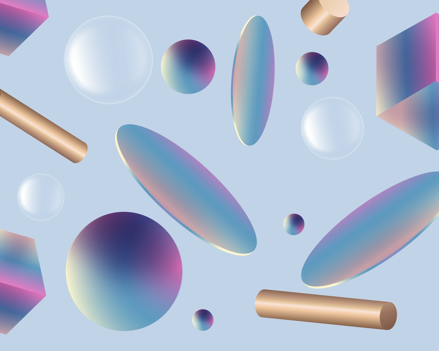
See-Through Goodness
Alright, see-through stuff in web design – who knew it could be so cool? This trend makes things look modern and classy, letting folks peek at the page background and keep their bearings. You get to keep the navigation at the forefront of attention without making it sit smackdab in the middle of everything.
| Element | What’s Cool About It? |
|---|---|
| See-through menu bar | Keeps it classy and clear |
| Partly see-through dropdown | Easy peasy and looks neat |
Balance is key here, folks – don’t let the see-through bits turn into an eyeball maze where people can’t read squat. Need pointers on decked-out minimal designs? Check our guide on going ‘less is more’ right here.
What Your Folks Want
You ever listen to what your website visitors are really saying? Well, not literally, but their clicks tell a story. Your site’s navigation should roll out the red carpet for them, making sure they find exactly what they came for – with no hassle.
| Visitor Group | What They’re After |
|---|---|
| SaaS Explorers | How it works, what it costs, trusty support |
| Online Shoppers | Product categories, hot deals, their cart |
| Ads Gurus | Your offerings, success tales, contact info |
Here’s the scoop: Slap on clear labels and keep users on the straight and narrow to the info they crave. Be the GPS they didn’t know they needed. Looking for some spark? Tap into our stash of web design ideas.
Keep It Tidy, Folks
You wouldn’t dump all your clothes in a heap and call it an organized wardrobe, right? Same with your website’s hierarchy – it’s gotta be neat and tidy, with everything in its place. It’s that virtual roadmap people need.
| Menu Kind | What It Might Include |
|---|---|
| Main Menu | Home, About, Products, Contact |
| Submenu | – Products: Cool Gadgets, Tech Wonders, Accessories Galore |
Nail that organized setup and your visitors will get where they need to go without a hitch. Breadcrumbs, anyone? They’re like the Hansel and Gretel guide to finding your way back home. And don’t forget about having consistent labels at every twist and turn. Curious how this looks in a mobile-friendly style? Check our responsive web designs to see the magic for yourself.
Sprucing up your navigation is just good old-fashioned common sense in web design. Toss in those see-through bits, peek into your visitors’ needs, and keep things in line. You’ll see happier visitors and better results. For more handy-dandy tips and tricks, click on over to our section on design tools.